Browse Webernaut

Browse by category

Perspective Shift

Experiences that change scale, perception, or context.

  • By Chrome Experiments and Google

    Drift through a three-dimensional map of nearby stars.

    Interactive star map showing the Sun surrounded by labeled nearby stars.
  • By Alex Wellerstein

    Visualize the scale and consequences of nuclear detonations anywhere on Earth.

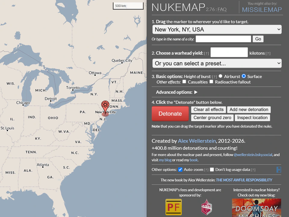
    NUKEMAP interface showing a map of North America with New York selected as the target and controls for choosing a nuclear weapon yield and detonation options.
  • By Étienne Fortier-Dubois

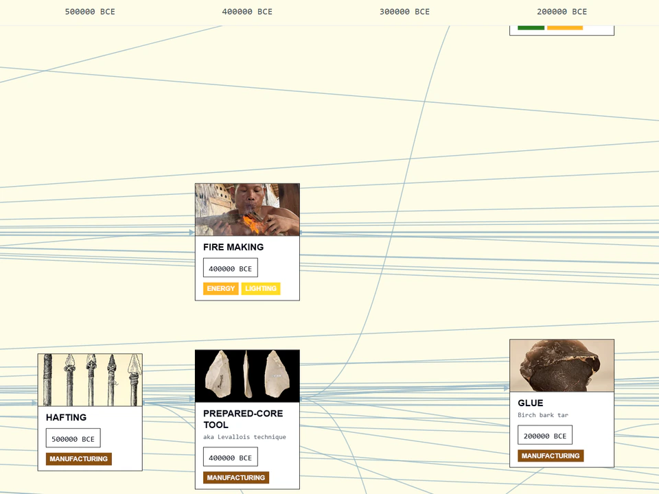
    Trace the branching evolution of technologies across human history.

    Timeline-style visualization showing connected cards for fire making, hafting, prepared-core tools, and glue across dates from roughly 500,000 to 200,000 BCE.
  • By Alicia Guo

    An evolving exploration of love, relationships, and human connection.

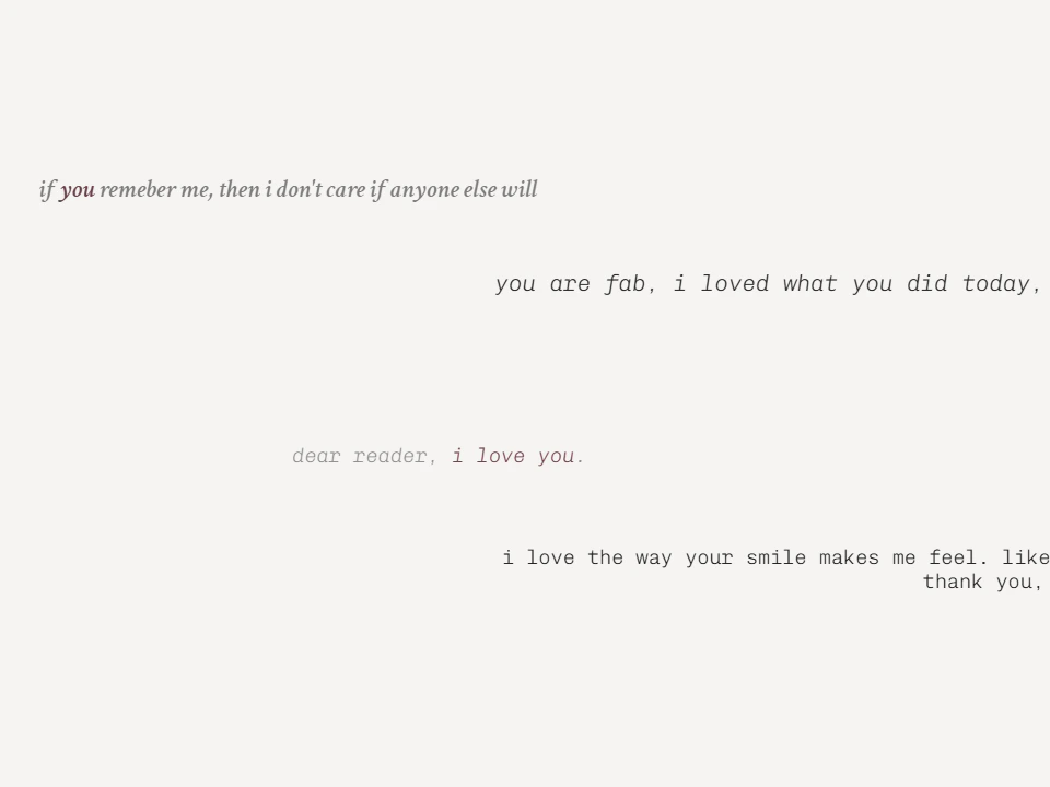
    Minimal Notes on Love webpage with several anonymous messages scattered across a pale background, including affectionate notes in different styles and positions.
  • By Jacob Jackson and Same Energy, Inc.

    Discover visually connected images through strange associative similarity.

    Collage-style gallery of varied photographs, illustrations, architecture, fashion imagery, and colorful abstract artwork arranged in a dense grid.
  • By Max Bittker

    Explore a visual connection engine for moving laterally through image space by following associative image…

    Collage-style webpage mixing fashion photography and bold graphic artwork, including masked faces, portraits, and a colorful “MAGIC” poster.
  • By Brice Ménard and Nikita Shtarkman

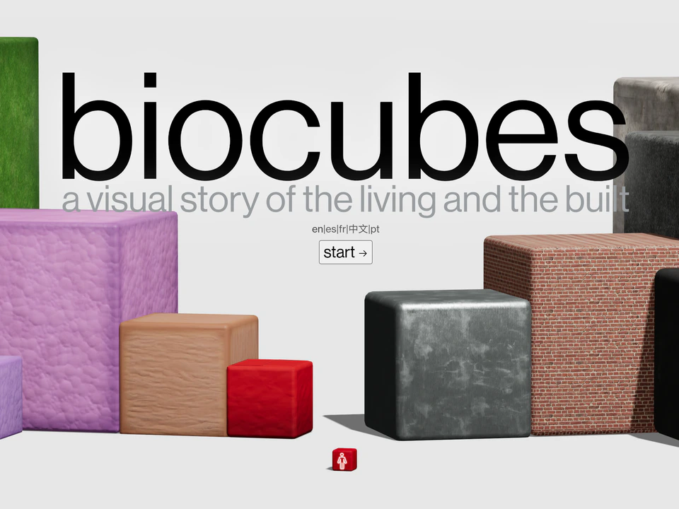
    Grow strange modular digital organisms from simple biological rules.

    Biocubes webpage with large “biocubes” title text, the subtitle “a visual story of the living and the built,” and colorful textured cubes surrounding a central Start button.
  • By Memories Group Limited

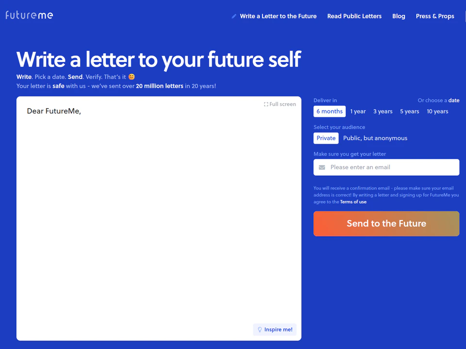
    Write a letter to your future self and send it forward through time.

    FutureMe webpage with a large “Write a letter to your future self” form, delivery-time options, audience settings, email field, and an orange “Send to the Future” button.
  • By OneZoom

    Wander through a living branching map of life on Earth.

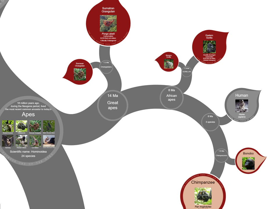
    Evolutionary tree visualization of apes showing branches for humans, chimpanzees, bonobos, gorillas, and orangutans, with species images and divergence times.
  • By Damon Maneice and James Talmage

    Drag countries across the globe and confront the distortions of map projections.

    Map of Africa with a translucent blue outline of the contiguous United States overlaid across the continent, illustrating how large the U.S. would appear when placed over western and central Africa.
  • Histography

    Desktop only

    By Matan Stauber

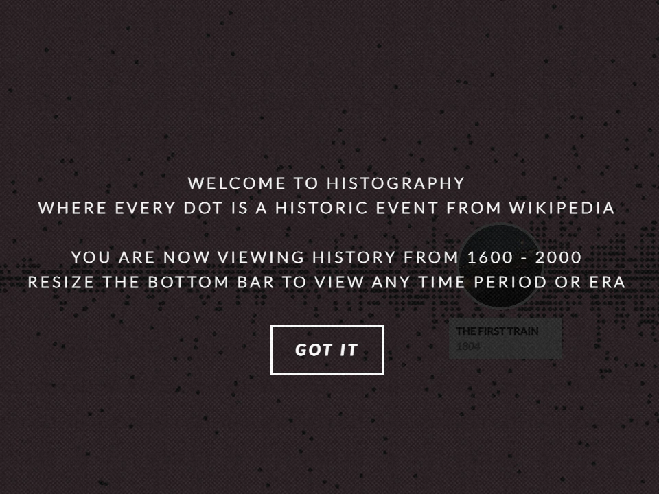
    Explore human history as an immense drifting timeline of events.

    Dark Histography webpage with introductory text explaining its interactive Wikipedia history timeline and a “Got It” button over a field of timeline dots.
  • By Ivo and Windyty, SE

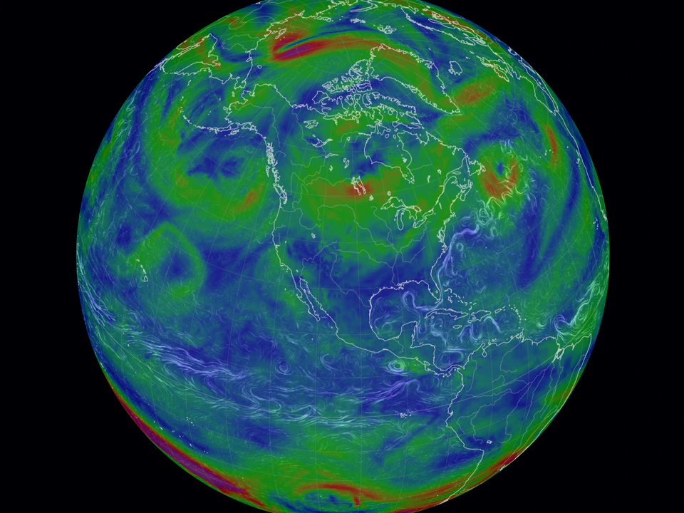
    Watch weather systems drift and unfold across the planet in real time.

    Colorful weather visualization centered on North America, with swirling green, blue, yellow, and red atmospheric patterns showing large-scale wind systems.
  • By Jerry Bonnell, Robert Nemiroff + 1 more

    A long-running daily ritual of astronomy, wonder, and quiet explanation.
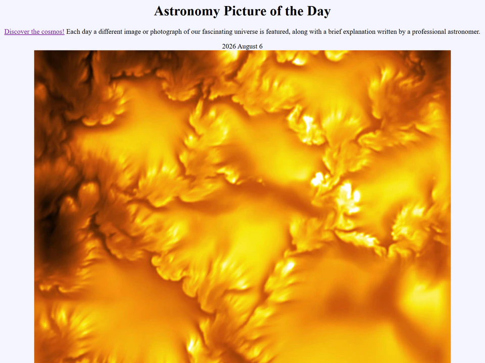
    Astronomy Picture of the Day webpage showing a vivid orange-and-yellow close-up image of the Sun beneath the page title and date.
  • By Neal Agarwal and Neal.fun

    Jump between strange, beautiful, and surreal moments captured around the world.

    Large carved stone head sculpture outdoors on a grassy hillside beneath a bright blue sky.
  • By Cameron Beccario and Nullschool Technologies Inc.

    Watch winds, currents, and atmospheric systems flow across a living Earth.

    Globe visualization centered on North America, with swirling blue, green, and red wind patterns over a black background.
  • By Luke Twyman and wvnl / Whitevinyl

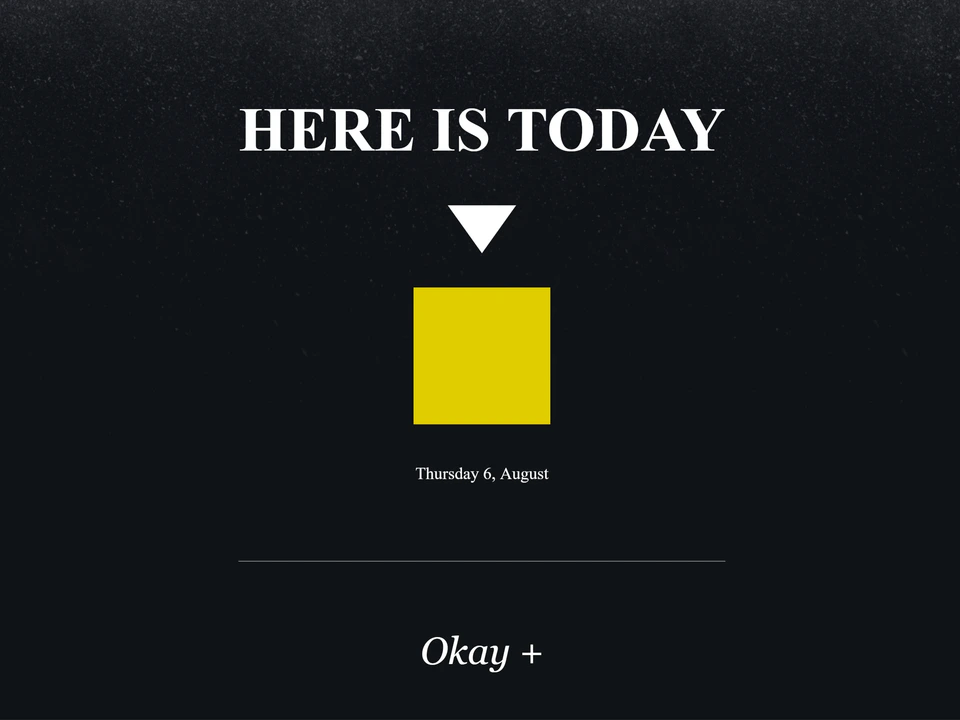
    A quiet meditation on presence, time, and the smallness of a single day.

    Dark webpage with the large text “Here Is Today,” a white downward arrow pointing to a yellow square labeled with the current date, and an “Okay +” prompt below.
  • By Toby Penner

    Wander through Wikipedia by following visual connections between ideas.

    Dark interactive network visualization for “World War II,” with colorful lines radiating from a central node and a sidebar listing related countries, events, and topics.
  • By Garth Henning and The Running Reality Organization

    Explore world history through an interconnected map of events and ideas.

    Interactive historical map of Britain showing the Kingdom of East Anglia highlighted, a Viking invasion route, a timeline across the top, and an information panel on the left.
  • By Matt Daniels and The Pudding

    Take a nostalgic journey as you watch and listen to popular music that rose and fell across the charts.

    Interactive music-history visualization showing Billboard Top 5 hits from 1986, with album artwork and ranked songs including “Rock Me Amadeus,” “Kiss,” “Manic Monday,” and “What You Need.”
  • By mkorostoff

    Scroll through a stark visual comparison of the wealth gap that exists in the world today.

    Bright blue wealth comparison graphic titled “400 richest Americans ($3.2 trillion),” with a large pie chart showing 39.6% and text about funding paid maternity and paternity leave for 100 years.
  • By Matt Daniels and The Pudding

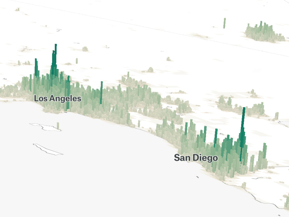
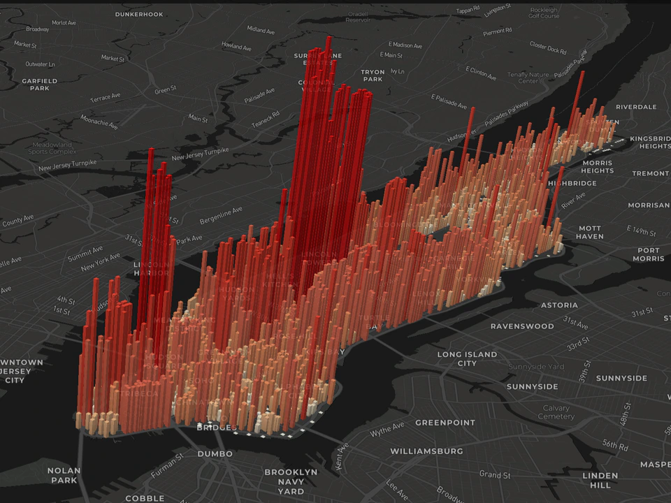
    Compare cities around the world using rich data visualizations that represent population, density and scale.

    3D population map of Southern California showing green vertical population spikes around Los Angeles and San Diego.
  • By Rosamund Pearce and Carbon Brief

    Explore the energy sources used to generate electricity across the United States.

    Map of the United States at night covered with colorful circles representing different electricity-generation sources, beneath the title “Mapped: How the US generates electricity.”
  • By Derek Taylor and The Pudding

    See how climate patterns may reshape cities in the decades ahead.
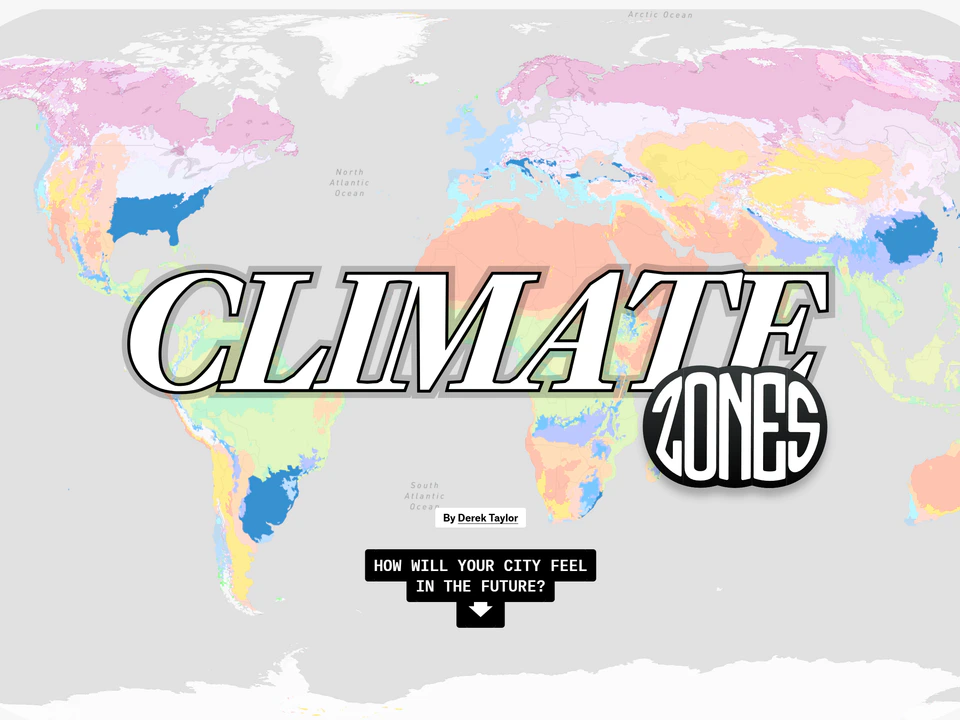
    World map of colored climate zones with the large title “Climate Zones” and the prompt “How will your city feel in the future?” displayed in the center.
  • By Matt Daniels and The Pudding

    See when cities across the United States last experienced record heat.

    Pale globe centered on Asia and Australia with the text “Days since a city had a record-high temperature” across the middle.
  • By Ruslan Enikeev

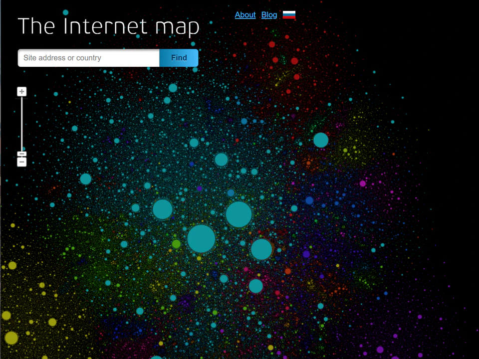
    Explore a snapshot of the web from 2011 as a vast galaxy of interconnected websites.

    The Internet Map webpage showing a dense field of colorful dots and circles representing websites, with a search box and zoom controls.
  • By Daniel Kunin

    Discover probability and statistics through interactive explanations you can explore yourself.

    Seeing Theory webpage with the title “Seeing Theory,” the subtitle “A visual introduction to probability and statistics,” a Start button, and colorful dots arranged around the edges.
  • By Nicky Case and Vi Hart

    Explore how seemingly harmless choices can create unexpected social impacts.

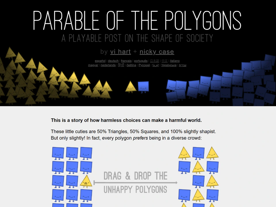
    Parable of the Polygons webpage showing yellow triangles and blue squares, with an introduction about how harmless choices can create a harmful world and an interactive drag-and-drop example below.
  • By Moniker

    A playful browser experiment whose constant attention gradually turns funny observations into an uneasy…
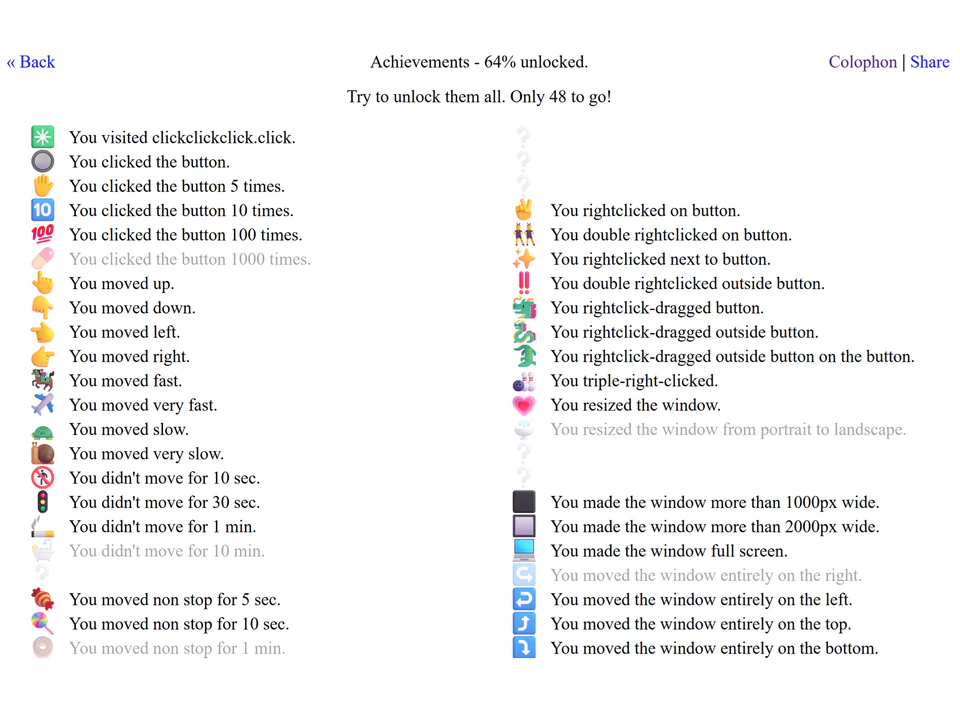
    ClickClickClick's Achievements screen listing tracked browser actions such as mouse movements, clicks, inactivity, and leaving the page.