
By Derek Taylor and The Pudding
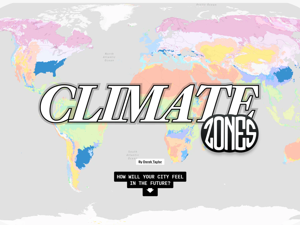
See how climate patterns may reshape cities in the decades ahead.
Curated Pick
A map can be much more than a way to get somewhere. These websites use geography to help you understand how places relate to one another and how the world changes depending on what you choose to look at.
By Derek Taylor and The Pudding
See how climate patterns may reshape cities in the decades ahead.
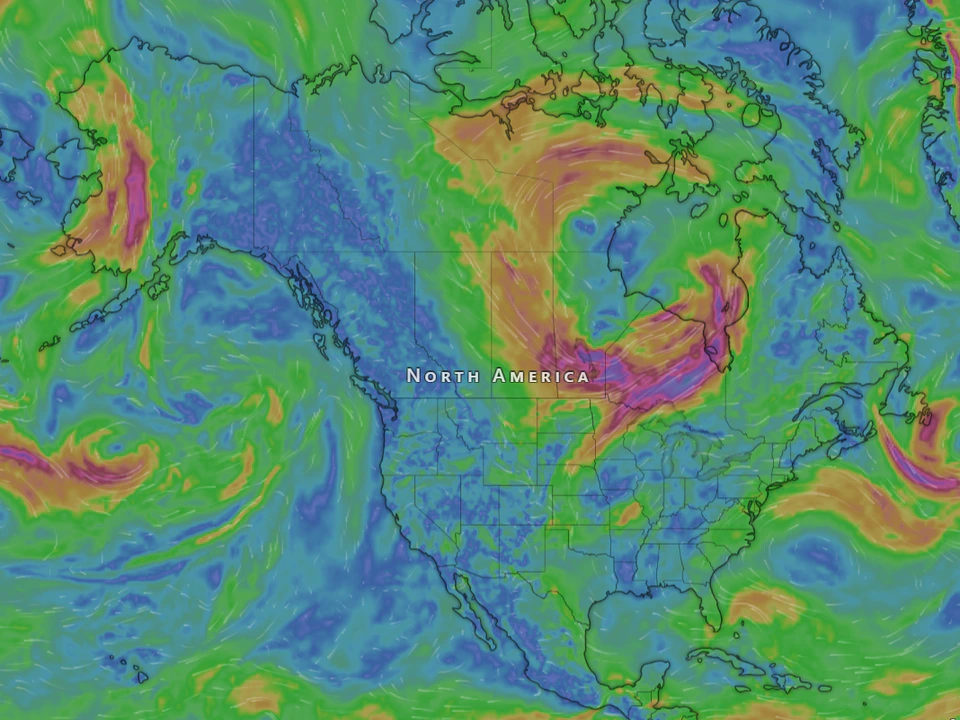
By Cameron Beccario and Nullschool Technologies Inc.
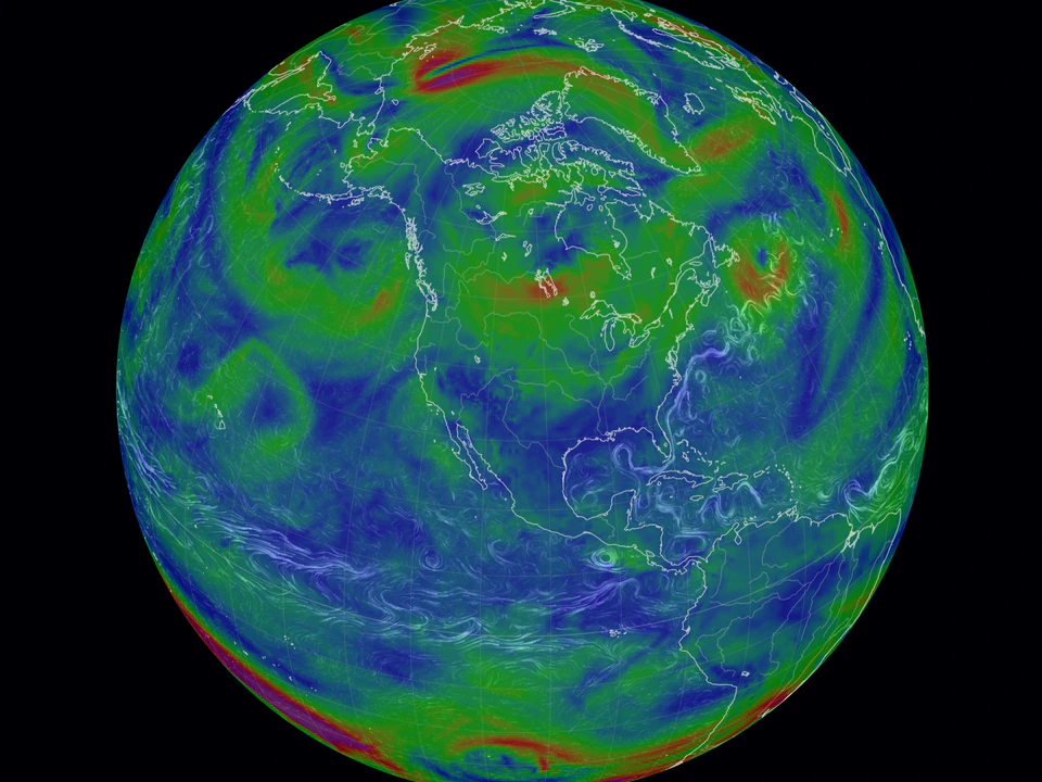
Watch winds, currents, and atmospheric systems flow across a living Earth.
By NASA and NASA LANCE
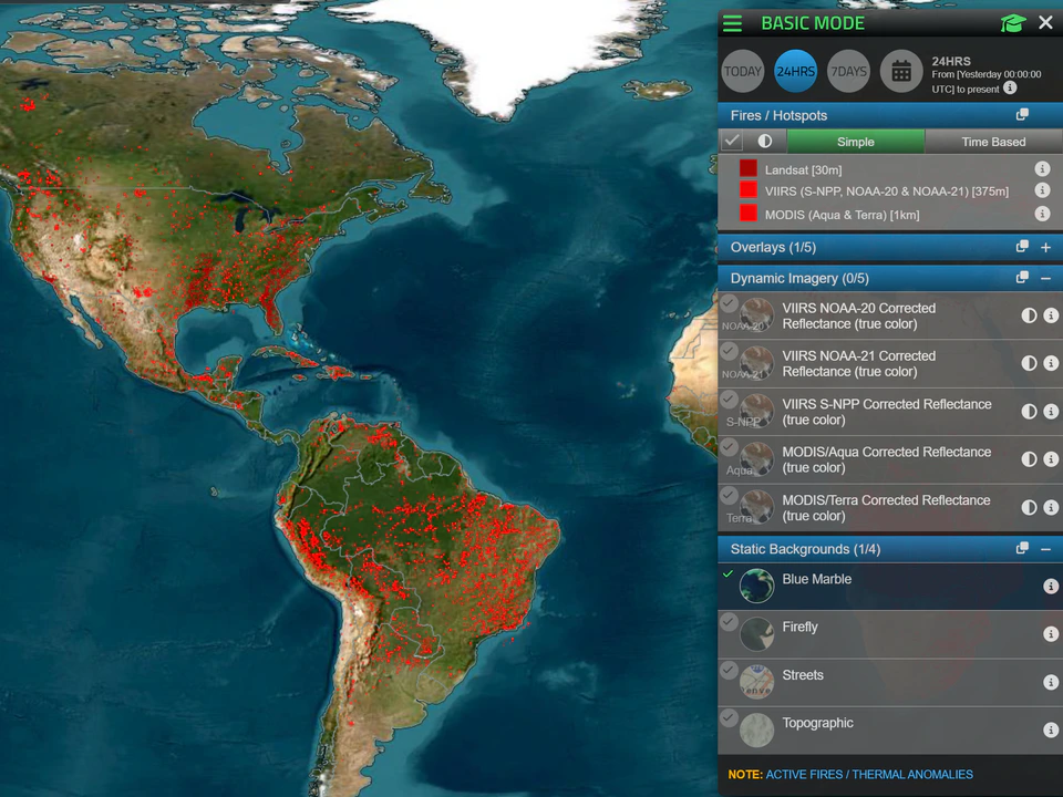
A planetary view of fires, heat sources, and thermal activity.
By Matt Daniels and The Pudding
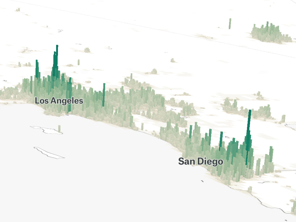
Compare cities around the world using rich data visualizations that represent population, density and scale.
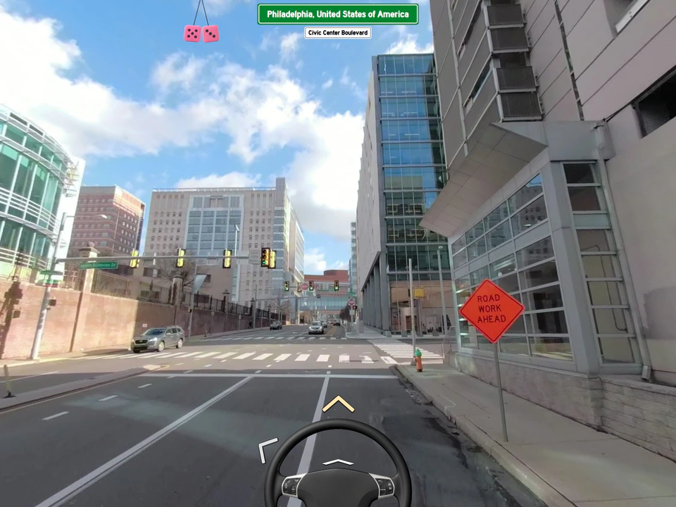
By Neal Agarwal and Neal.fun
Collectively steer a car through Google Street View with strangers online.
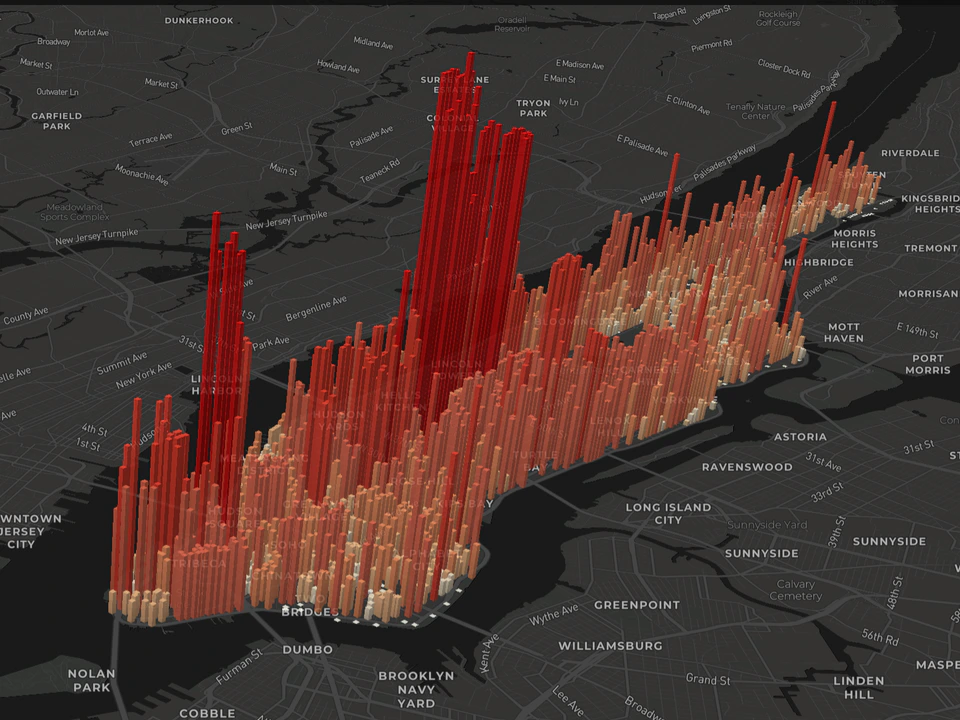
By Justin Fung
Reveal the hidden rhythms of Manhattan through layers of population data.
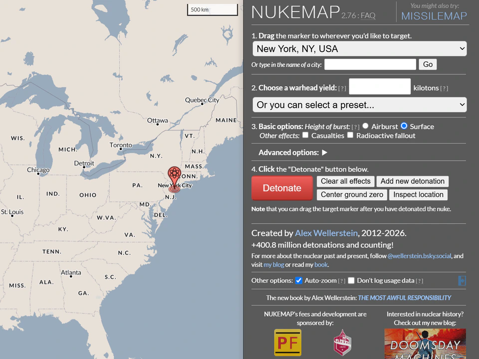
By Alex Wellerstein
Visualize the scale and consequences of nuclear detonations anywhere on Earth.
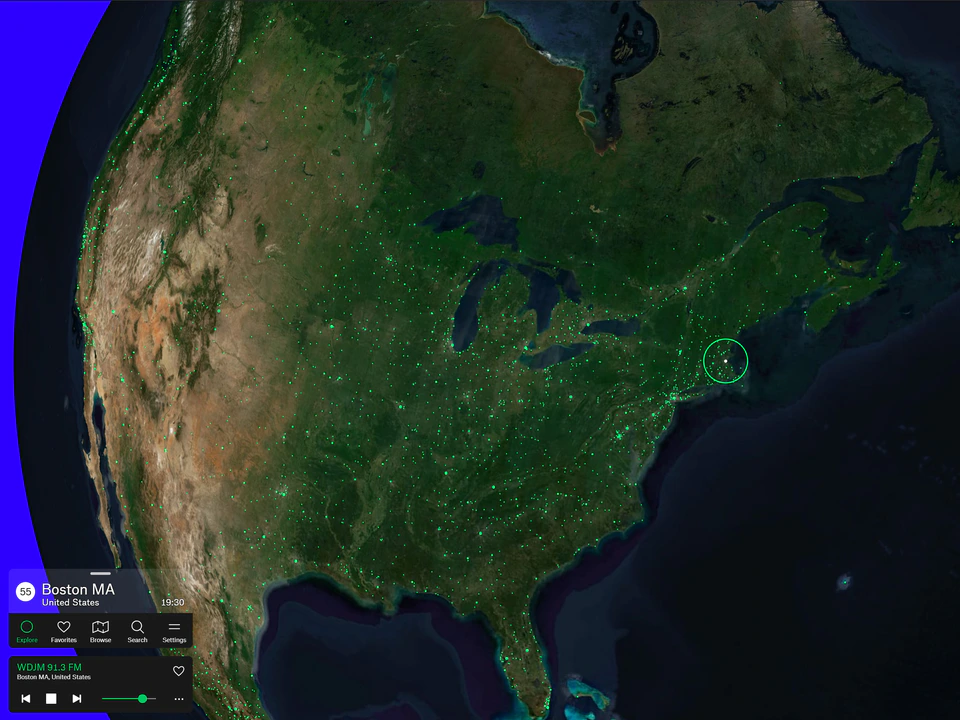
By Jonathan Puckey, Moniker + 1 more
Drift between live radio stations across the planet.
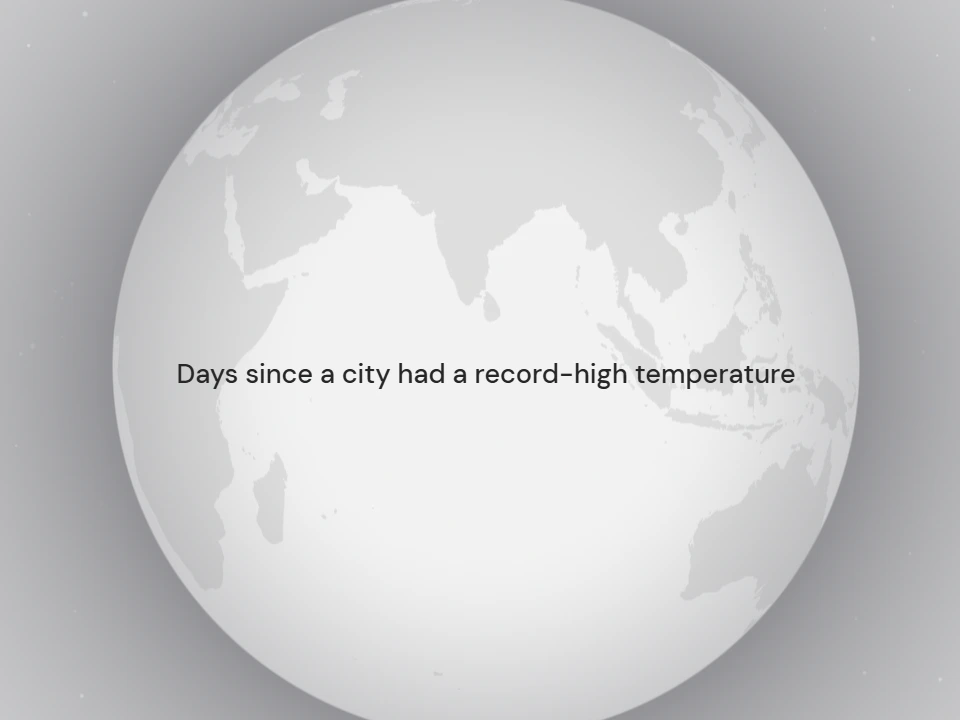
By Matt Daniels and The Pudding
See when cities across the United States last experienced record heat.
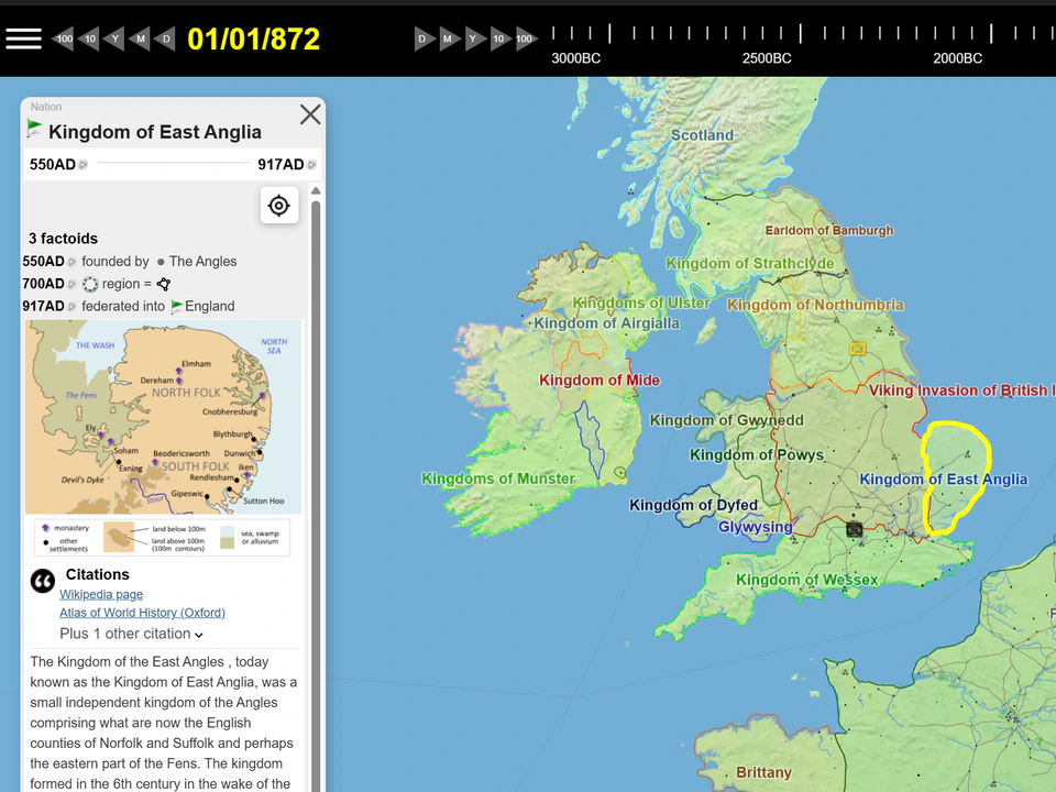
By Garth Henning and The Running Reality Organization
Explore world history through an interconnected map of events and ideas.
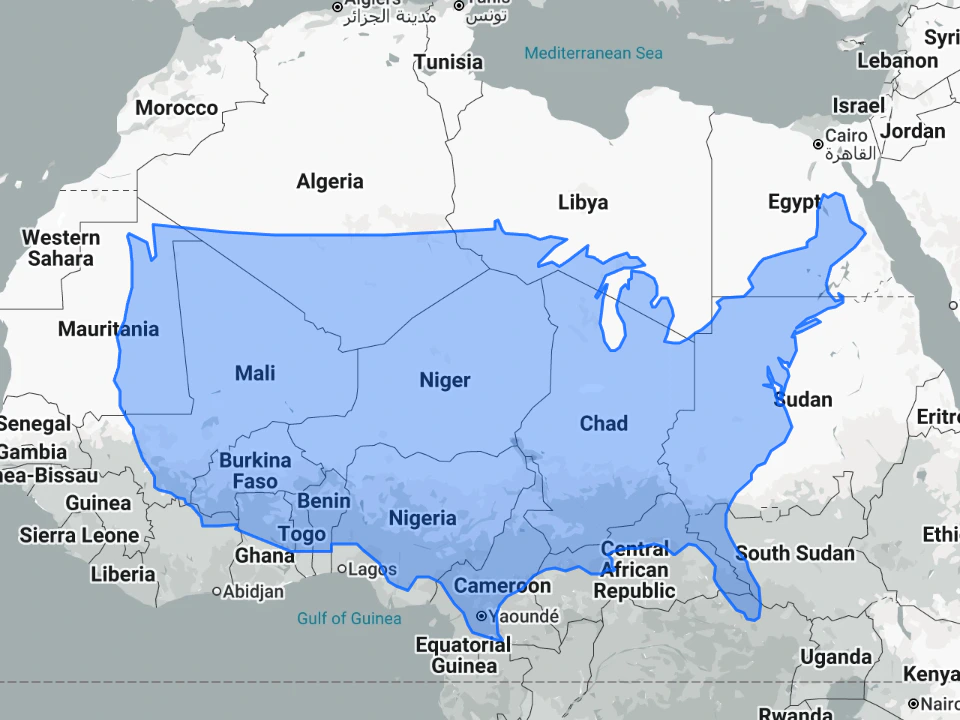
By Damon Maneice and James Talmage
Drag countries across the globe and confront the distortions of map projections.
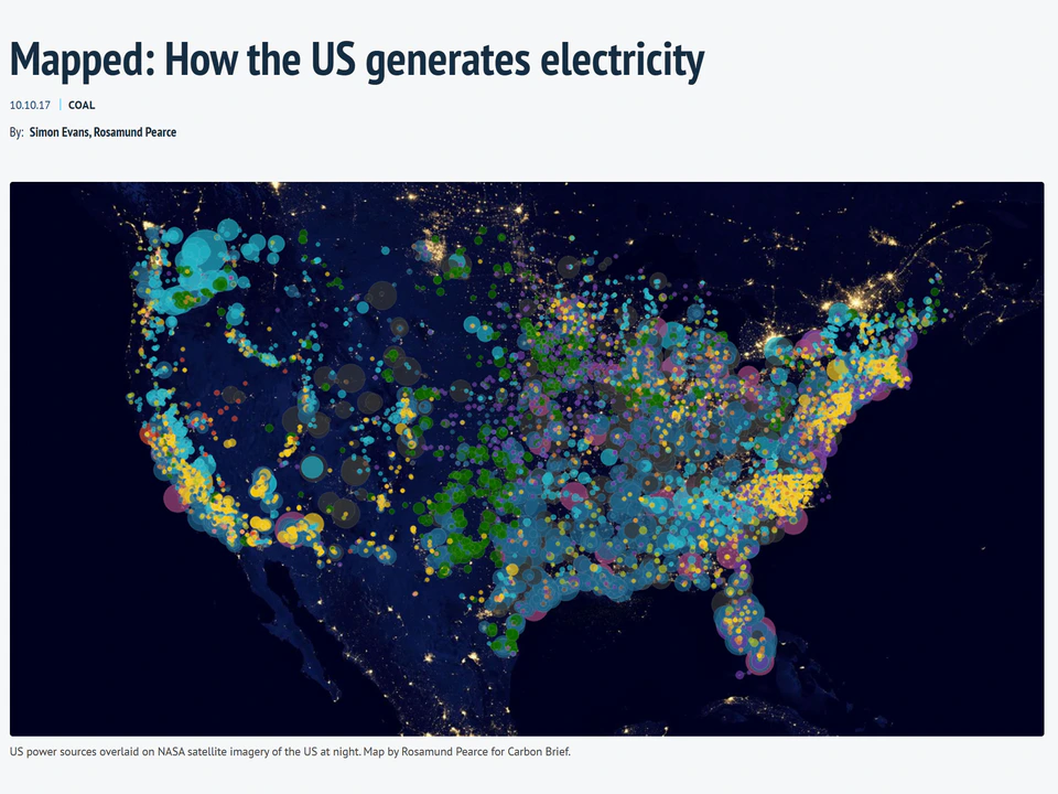
By Carbon Brief and Rosamund Pearce
Explore the energy sources used to generate electricity across the United States.
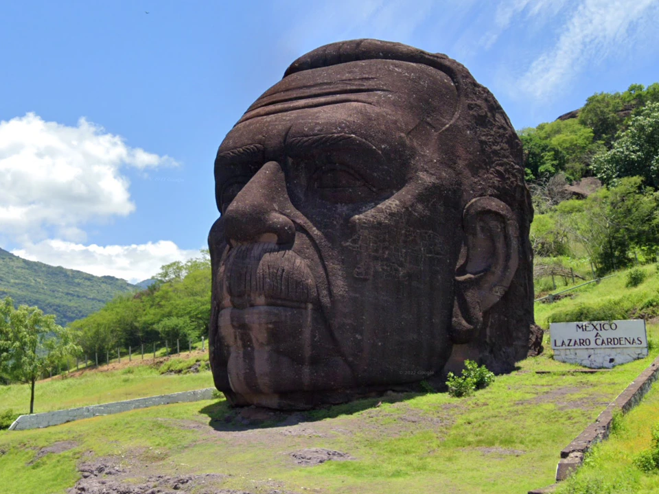
By Neal Agarwal and Neal.fun
Jump between strange, beautiful, and surreal moments captured around the world.
A browser-based live 3D experience that lets you explore views from aircraft and satellites, rendering the sky…

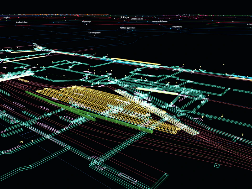
By Greggman
Tokyo Trains is an interactive visualization of Tokyo’s railway network with time playback, date selection…
16 Discoveries loaded. All results loaded.
All items loaded